• Work
  • About
  • CV
  • Contact

Chloë Alexander Design

Fine Typography and Design for print

  • Work
  • About
  • CV
  • Contact

Bartók Edition

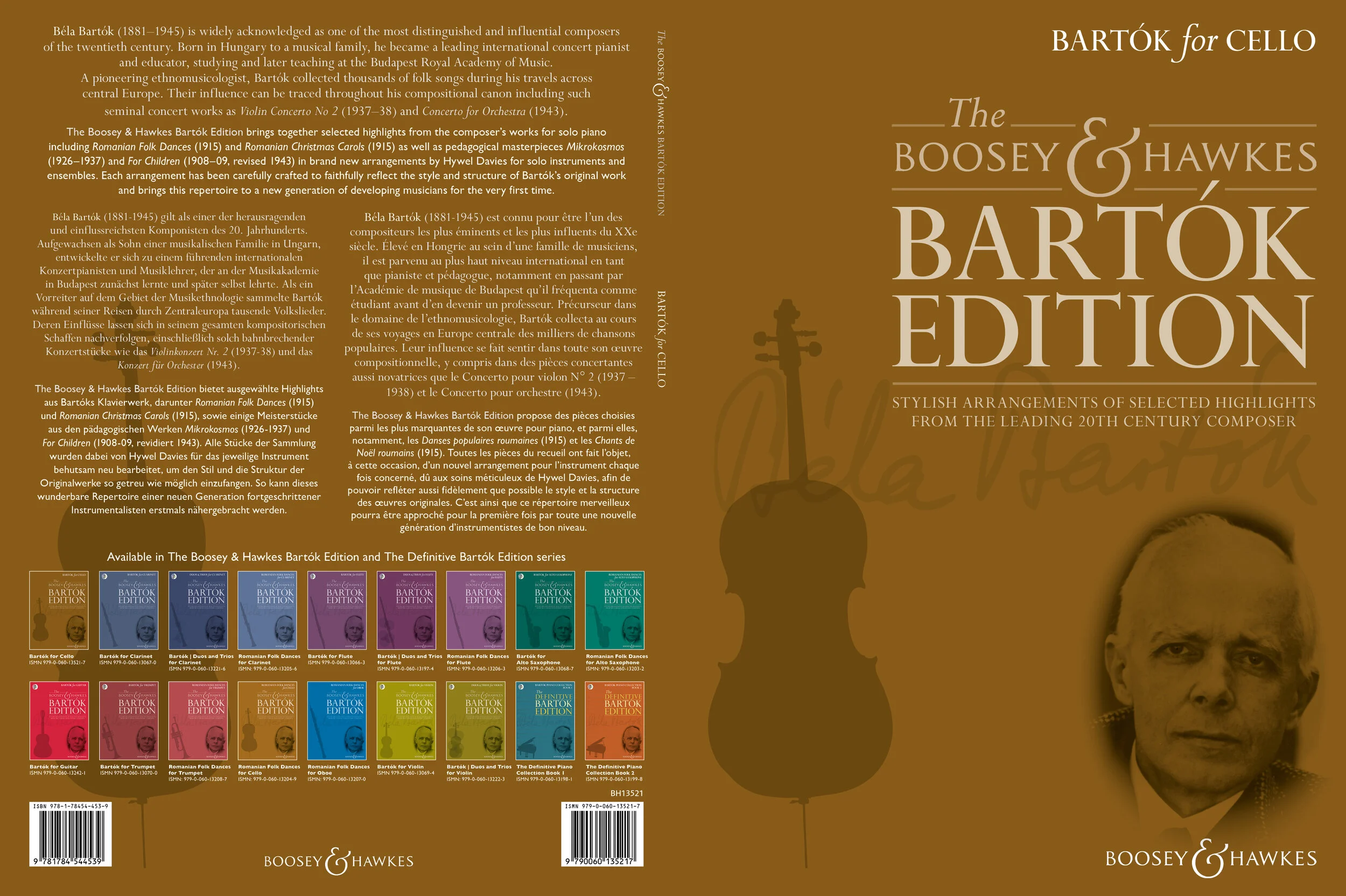
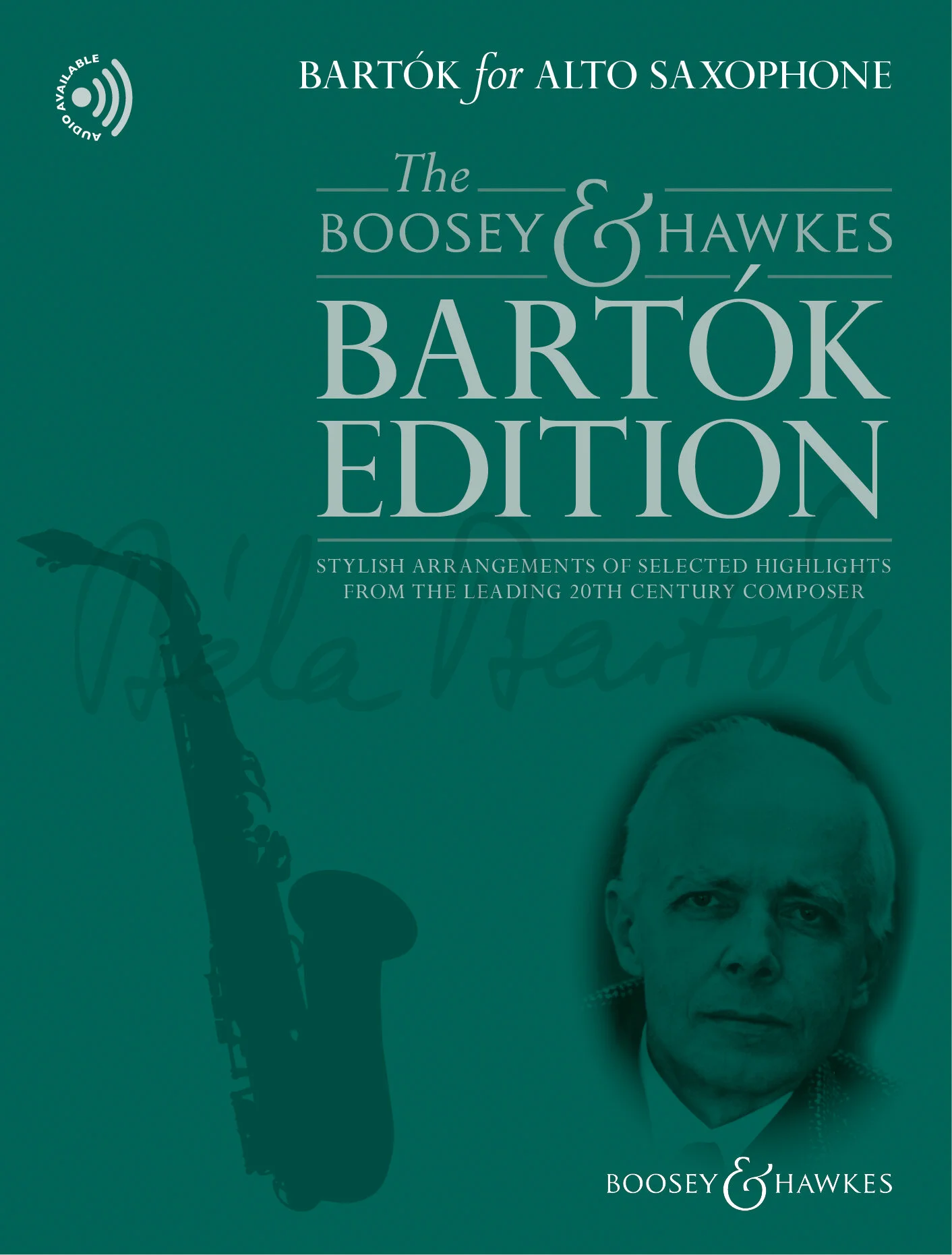
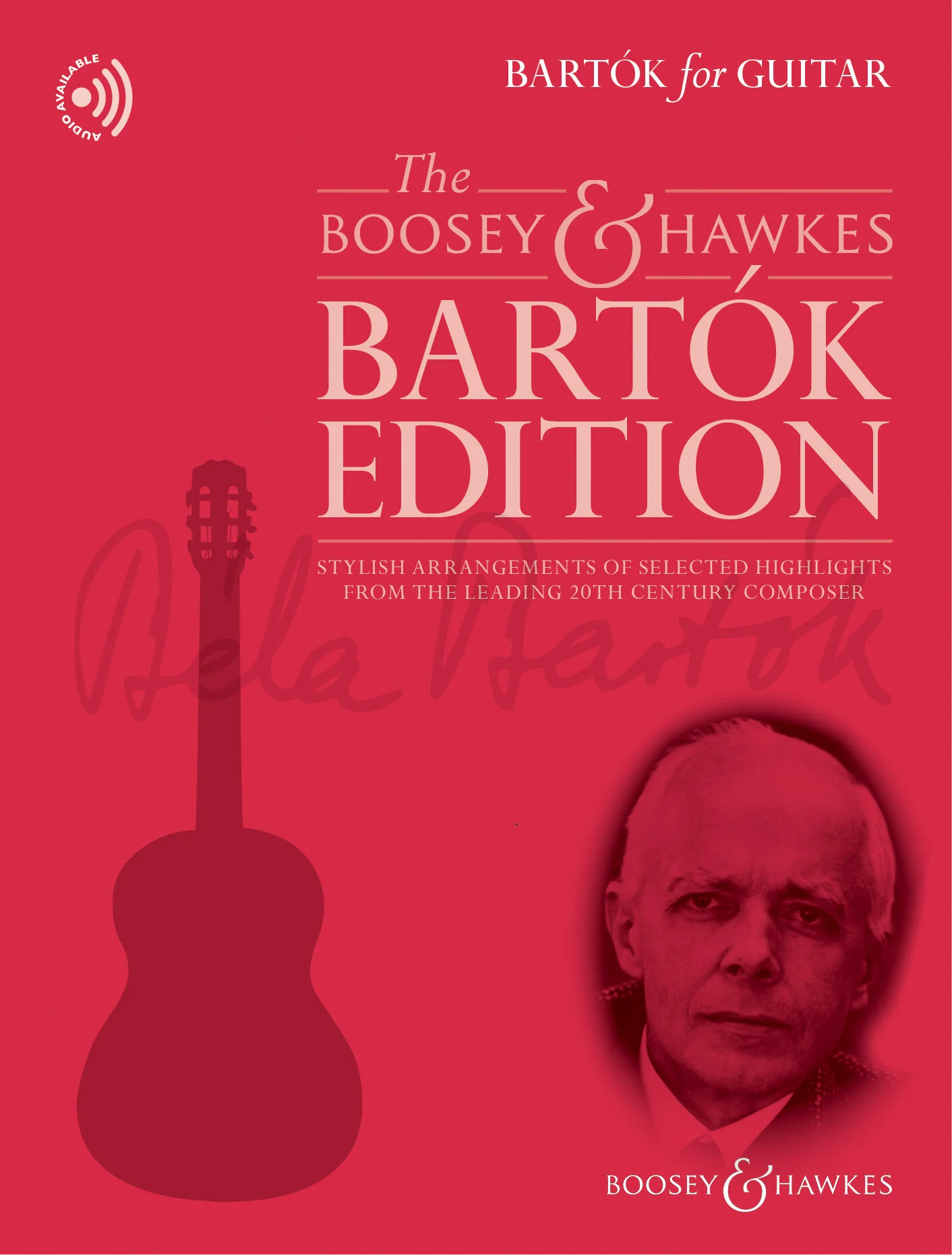
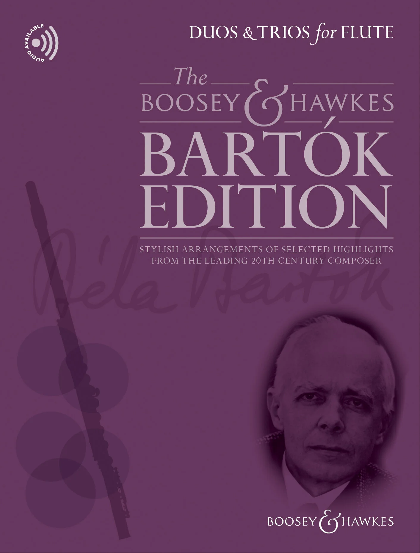
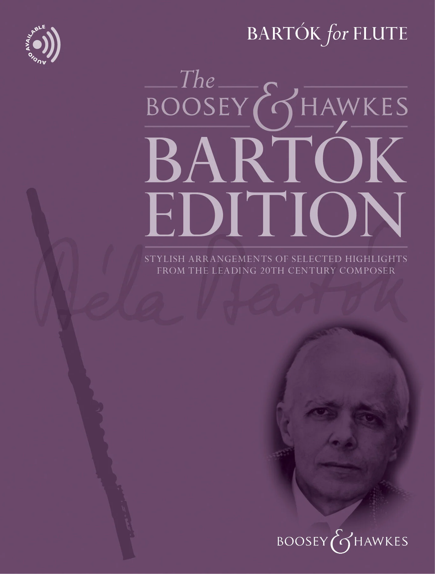
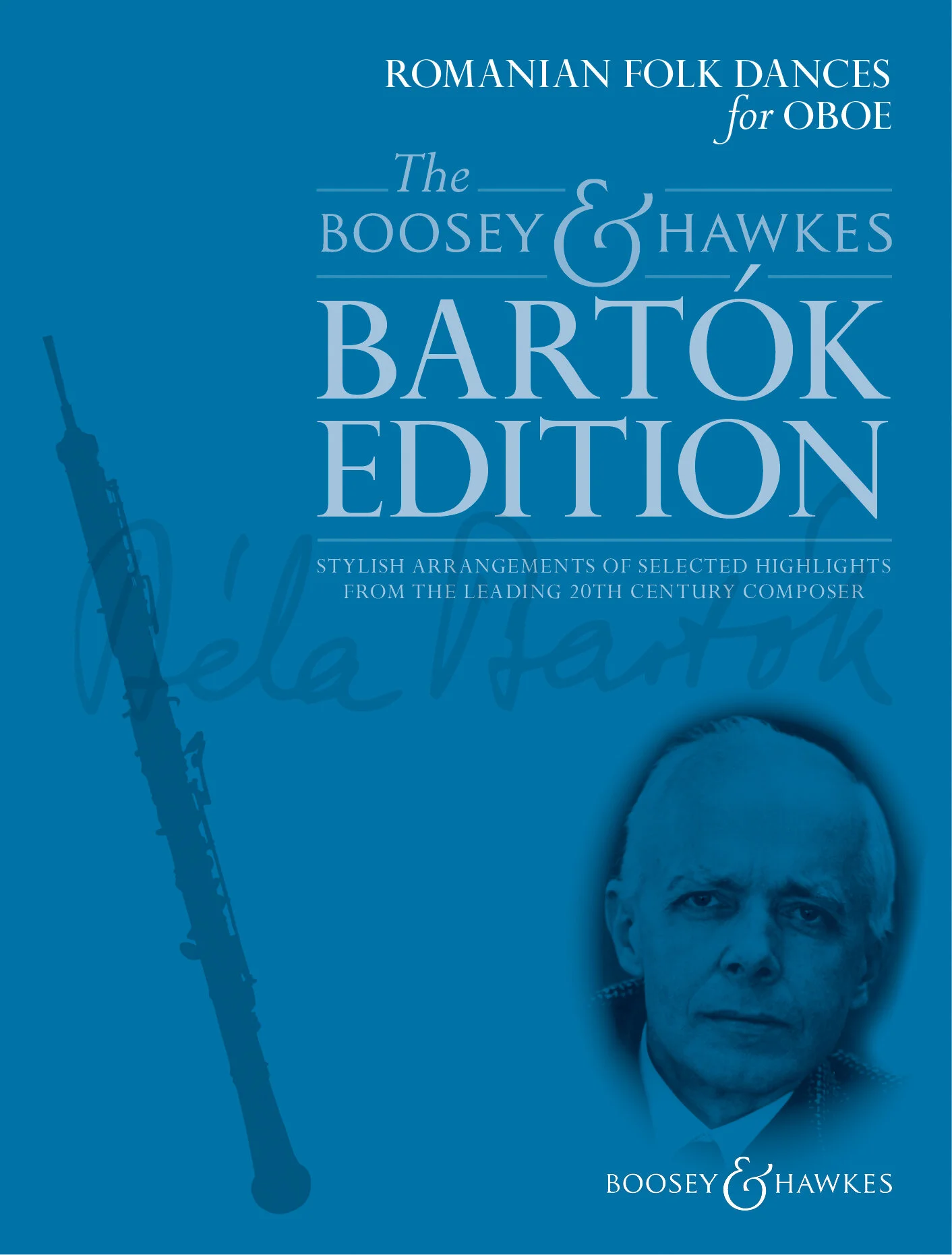
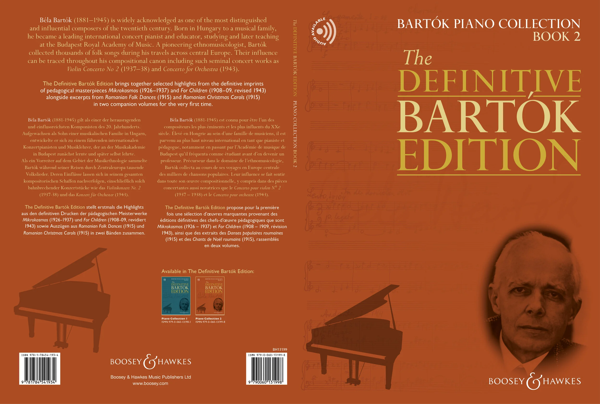
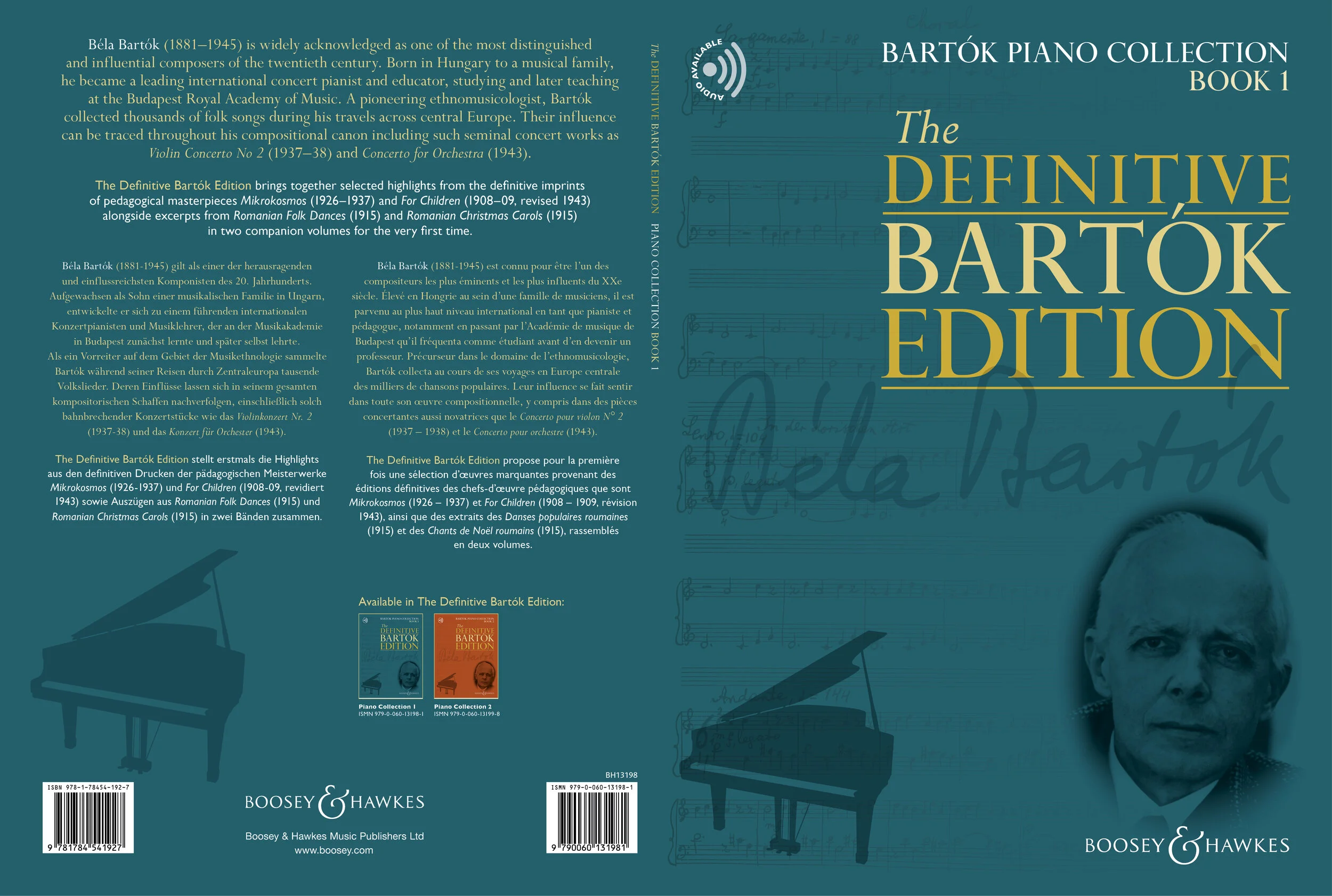
Bartók Edition was a major series for Boosey & Hawkes and although there are only seven colours in the rainbow, each cover required a different colour. Some judicious use of tints came into play and they all look very jaunty grouped on the back. I was especially pleased with the typography here, nestling the accent on the capital O neatly into the block, echoing the enlarged ampersand of the B & H logo.

Client: Boosey & Hawkes 2015-

Bartok_Edition_Cover.jpg
Bartok_Edition_Cover2.jpg
Bartok_Cello_Cover.jpg
Bartok_Front_Full Set8.jpg
Bartok_Front_Full Set9.jpg
Bartok_Front_Full Set15.jpg
Bartok_Front_Full Set14.jpg
Bartok_Front_Full Set12.jpg
Bartok_Front_Full Set18.jpg
Bartok_Front_Full Set10.jpg
Bartok_Front_Full Set11.jpg
Bartok_Front_Full Set19.jpg
Bartok_Front_Full Set6.jpg
Bartok_Front_Full Set5.jpg
Bartok_Front_Full Set7.jpg
Bartok_Front_Full Set3.jpg
Bartok_Front_Full Set2.jpg
Bartok_Front_Full Set4.jpg
Bartok_Front_Full Set13.jpg
Bartok_Front_Full Set17.jpg
Bartok_Front_Full Set16.jpg
Bartok_Definitive_Cover2.jpg
Bartok_Definitive_Cover.jpg

Powered by Squarespace.